

I wanted two things out of this anniversary: One, a big fight with lots of characters. More like issue #50 than #100 and #150 — a large-scale choreography of people and vehicles over geography. And issue #200 checked that box. Two, I wanted guest artists and back-up stories. I didn’t get this, but I’m still a happy reader.
Initially I wanted pin-ups by “hot” guest artists, but variant covers from the last five years have scratched that itch. When G.I. Joe was on its way out at Marvel, covers by artists of the caliber of a Dave Johnson were unthinkable. Now they’re commonplace. So then I thought back-up stories.
This goes back to issue #1 (“Hot Potato”) and issue #50 (“Best Defense”) — writer Larry Hama can often do great work with a limited canvas. Issue #200 had no guest artists, but the back matter that stretched out this book to double-size was fun and interesting. Not essential, but fun. I appreciated the return of the letters page, even if the font was too big and it looked like editor Carlos Guzman was killing time. The interview with series artist SL Gallant was interesting — I didn’t realize he practices martial arts, and that they inform his comics fight choreography is neat.
The three black and white pages made for pleasant comparisons, but served to remind me that I haven’t been wowed by any of the inking on this version of G.I. Joe. Juan Castro and Marc Deering (and Gary Erskine before them) do fine work, but this book needs a Bob McLeod, someone who more differentiates between organic and mechanical shapes and lines — a bigger variety of thin and thick, and chunks and details. It’s not bad inking. It’s fine. But it doesn’t wow me.
Those black and white pages also reminded me of how much I dislike all the color art. An editor once said that some months J. Brown is given just a few days to color a whole issue of G.I. Joe. I have sympathy for inkers, letterers, and colorist who have to make up for writers and pencilers (or editors) that crash deadlines. But what I’ve seen in every single issue of IDW’s Real American Hero series is coloring I completely disagree with. Objects are over-rendered, and most everything is equally oversaturated. Highlights are all over the place, most having no discernible light source. Everything competes with everything else. Color gradients get lighter with white added and darker with black added, which makes for murky, overly dark printing. Everything is colored in isolation, and there’s no sense of color families. The cover offers an example or two. The lens flare on the headlight of the HISS tank is terribly distracting. That’s what I should look at before Duke and Cobra Commander? And the blue and olive hues in the sides of the tank treads — what is that? And the blue in the rocks and cacti on the bottom left. Mr. Brown may know Photoshop, but he doesn’t demonstrate a sense of color theory. But I don’t want to dwell on what I don’t like, set let’s jump (get it?) to two aspects I do: Writing and art.
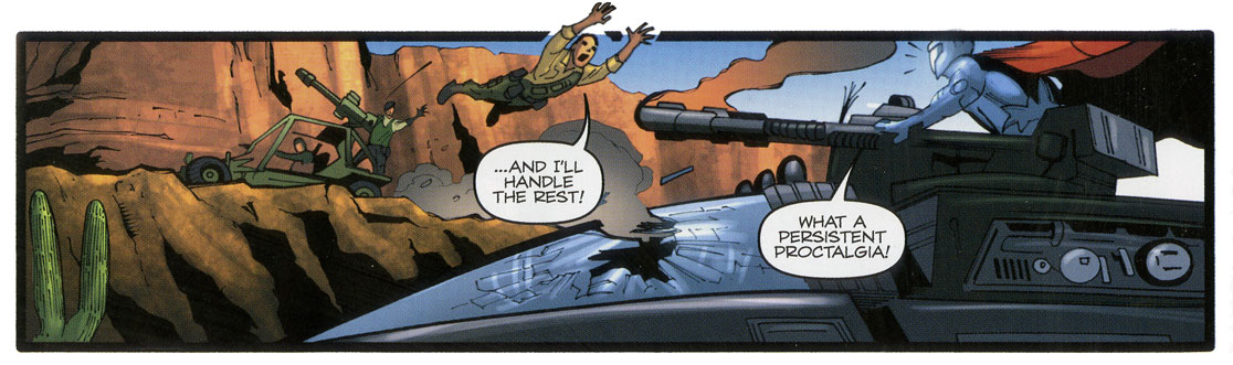
The revelation of a whole ‘nother Pit under the Pit is silly, but I’ll go with it because it’s the kind of ret-con Larry Hama can make work. It’s not all that different from the Joes getting a new Pit somewhere else — another subterranean base, a floating complex, an island, so why not another Pit under the Pit? In terms of the big picture, it’s a thrill seeing so many characters and vehicles. Hama’s great with dialogue about vehicle directions and flanking. He has a great sense of the geographic physicality of an action scene, something I don’t see much in other comics, especially the Big Two’s super-hero fights, where characters tend to just hit each other regardless of how tracking through an X, Y, or Z axis might be interesting. Gallant keeps everything clear, especially with the AWE Striker getting separated from the HISS tank. Love that panel of Duke jumping. Yes, “G.I. Joe” is grounded, but it’s also larger than life, and comics can be fun. Gallant’s up to the task of keeping track of so many elements in continuity — pg 23 for example: the smokescreen, the Flight Pods, the Joe tanks, and the Broca Circus trucks, and what side of the action we the reader are on.
Happy anniversary! Fun issue! Here’s to 200 more.
Next: G.I. Joe Convention 2014 report. Then, musings on my comic book store giving away G.I. Joe #200.

Great review, Tim. Very much in line with my own thoughts. Looking forward to your experience giving away 200 copies, that was a really incredible service to the fan community. Also, it was great finally getting to meet you at JoeCon, been a fan of your site for a long time. Keep up the good work!
My take on the old base below the Pit is that it was the base for Colton’s original G.I. Joe team from the 60s. And aside from the inks and colors, I wanted to throw some praise out there to S.L. Gallant. I’ve been rereading much of this series and he’s become one of my favorite G.I. Joe artists of any era.